
The approach to the packaging design for Mojave Mallows has been rooted in color, effervescence, and bold copy. After identifying a need for a larger bag size, we chose to favor color over the product photography pictured front and center on our initial mini bags.
![]()
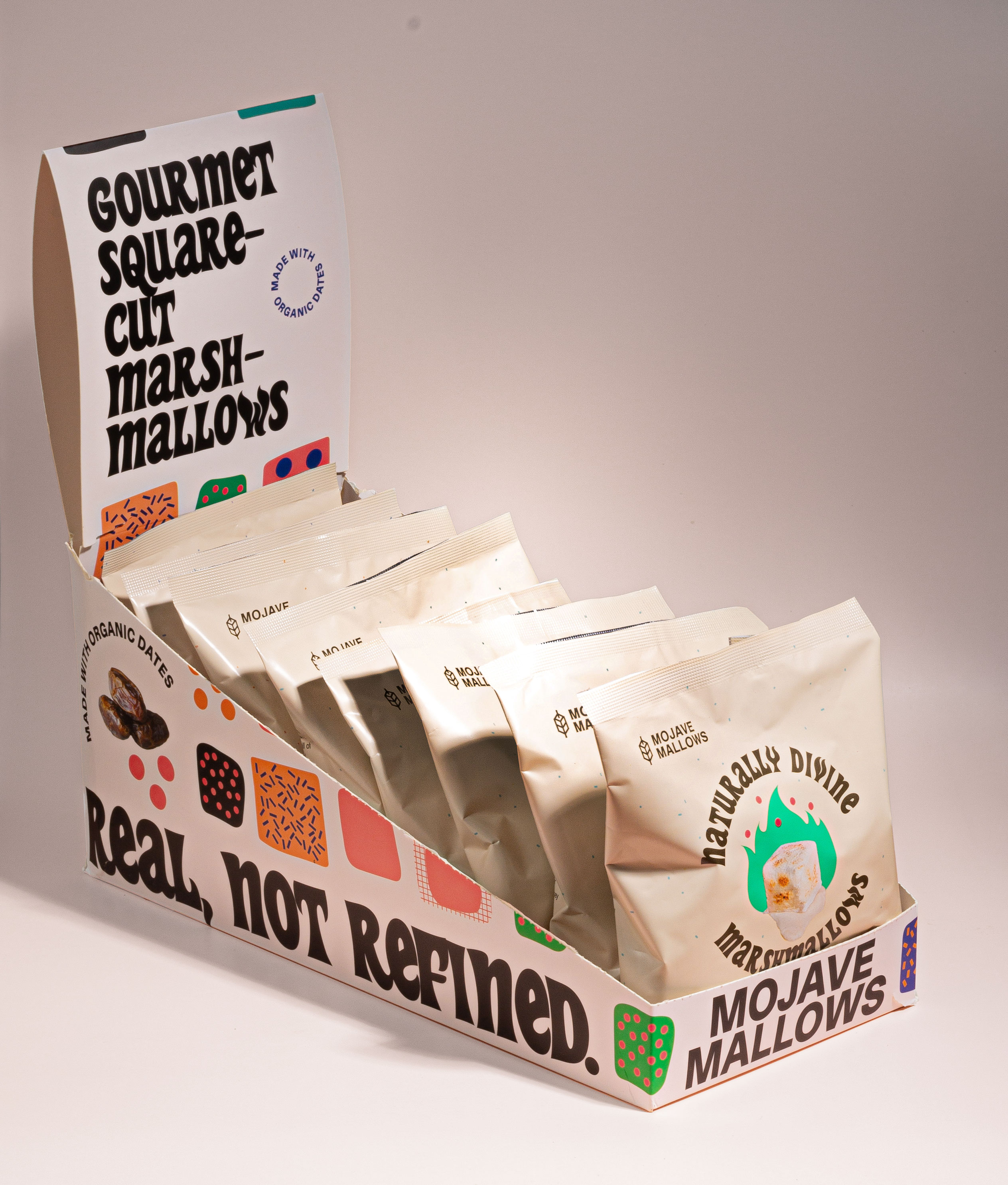
The mini bags had led with photographic elements to demonstrate the unique shape of hand-cut marshmallows. We took this shape and celebrated it instead as an illustrated motif throughout the packaging, on the point-of-sale boxes, packing tape, and the bags themselves.
![]()
![]()
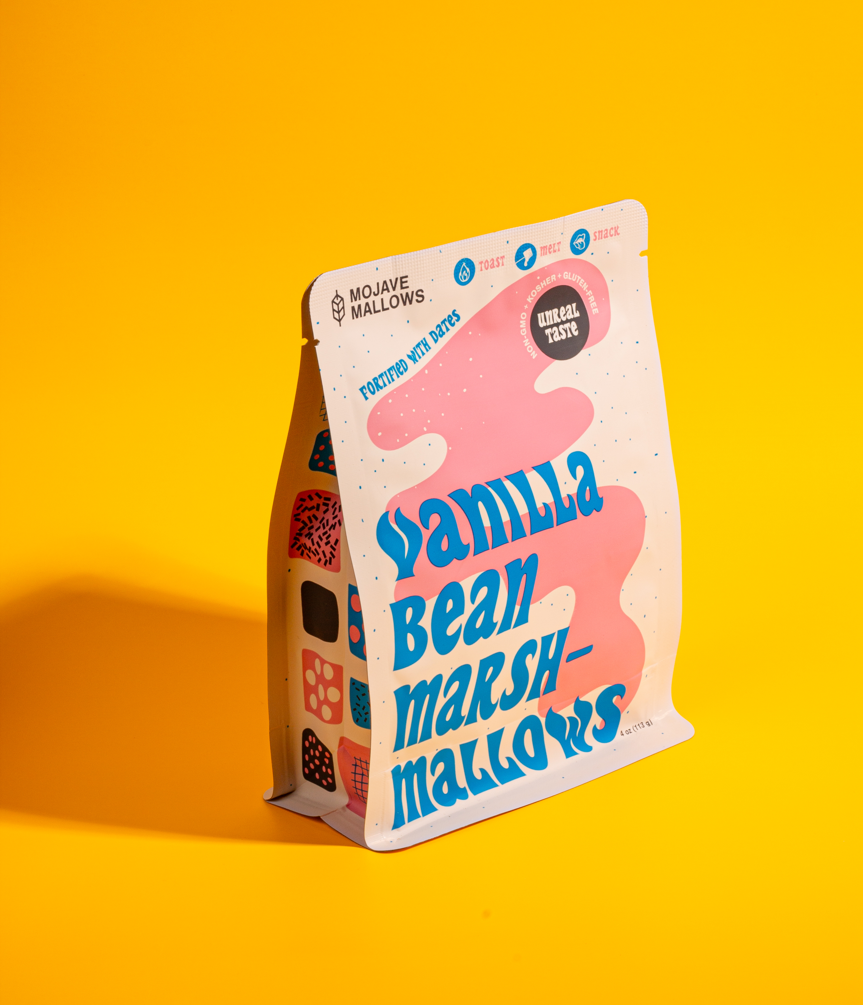
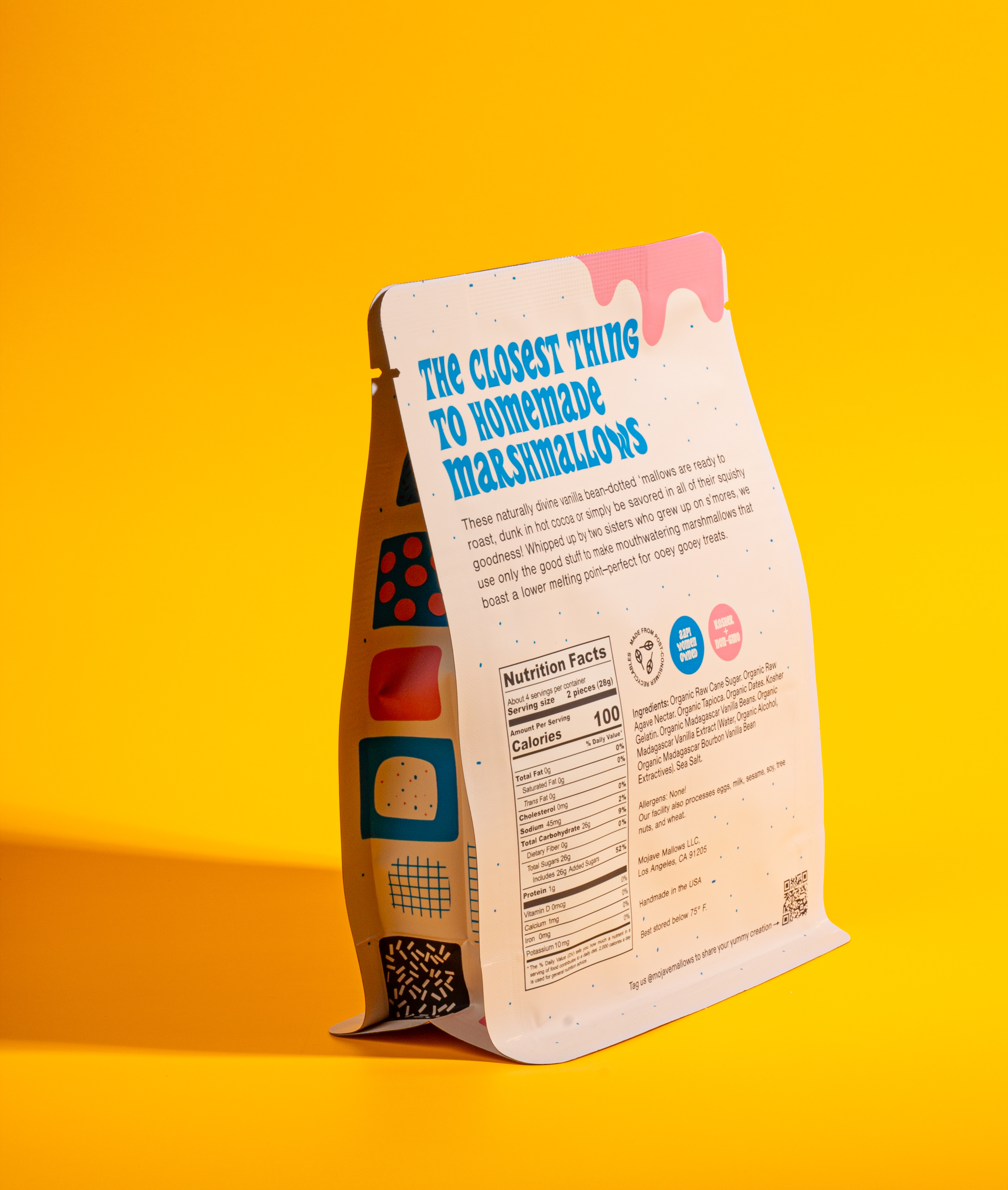
The larger bags gave us the opportunity to have a bit more fun. We puckered and skewed a swirly psychadelic type treatment with bright colors. The copywriting became front and center, dripping with punchy key benefits and alliteration.
![]()
![]()
Color cues were taken from nostalgic childhood candies, and the bag’s final shape was inspired by our favorite artisanal coffee bags.
![]()
![]()
To reflect the company’s commitment to sustainability, all pouches are made with post-consumer recycled materials.
Thanks and Credits
Thanks to Elisa Foster for her role in shaping the brand typeface and logo.
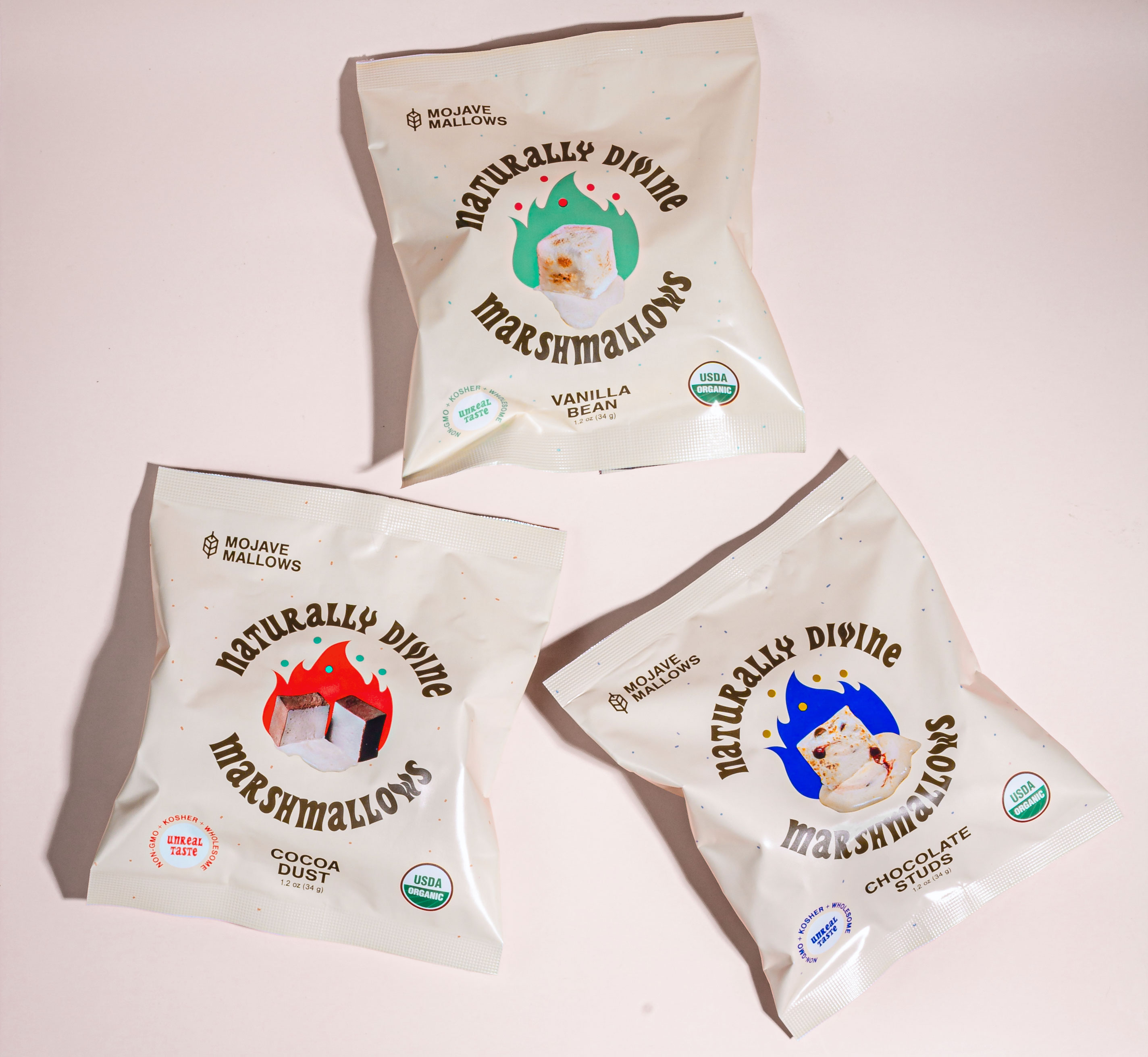
The mini bags had led with photographic elements to demonstrate the unique shape of hand-cut marshmallows. We took this shape and celebrated it instead as an illustrated motif throughout the packaging, on the point-of-sale boxes, packing tape, and the bags themselves.

The larger bags gave us the opportunity to have a bit more fun. We puckered and skewed a swirly psychadelic type treatment with bright colors. The copywriting became front and center, dripping with punchy key benefits and alliteration.
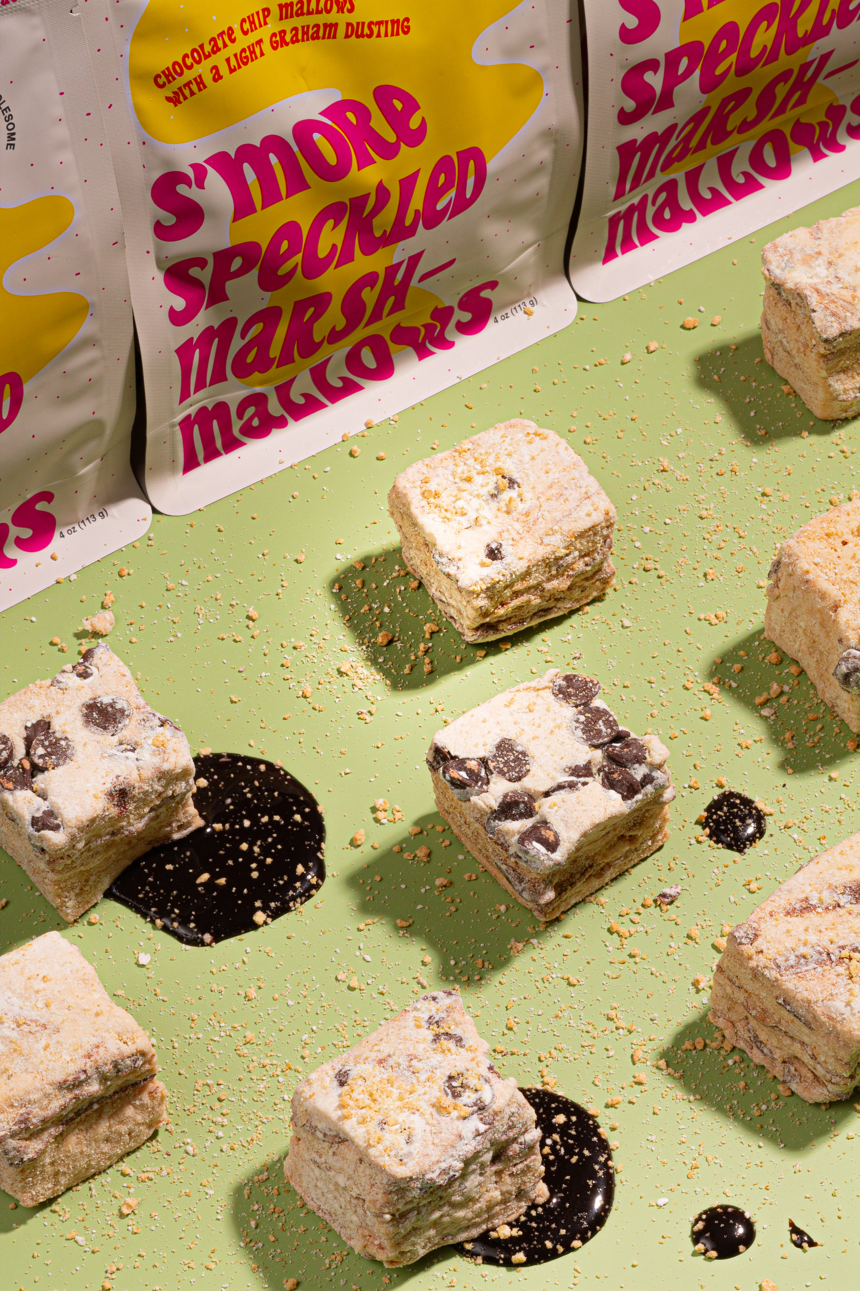

Color cues were taken from nostalgic childhood candies, and the bag’s final shape was inspired by our favorite artisanal coffee bags.
To reflect the company’s commitment to sustainability, all pouches are made with post-consumer recycled materials.
Thanks and Credits
Thanks to Elisa Foster for her role in shaping the brand typeface and logo.